
The Problem
The Camrose Ski Club would like to update they brand as they believe there is lack of clarity between the other programs people may not know about.


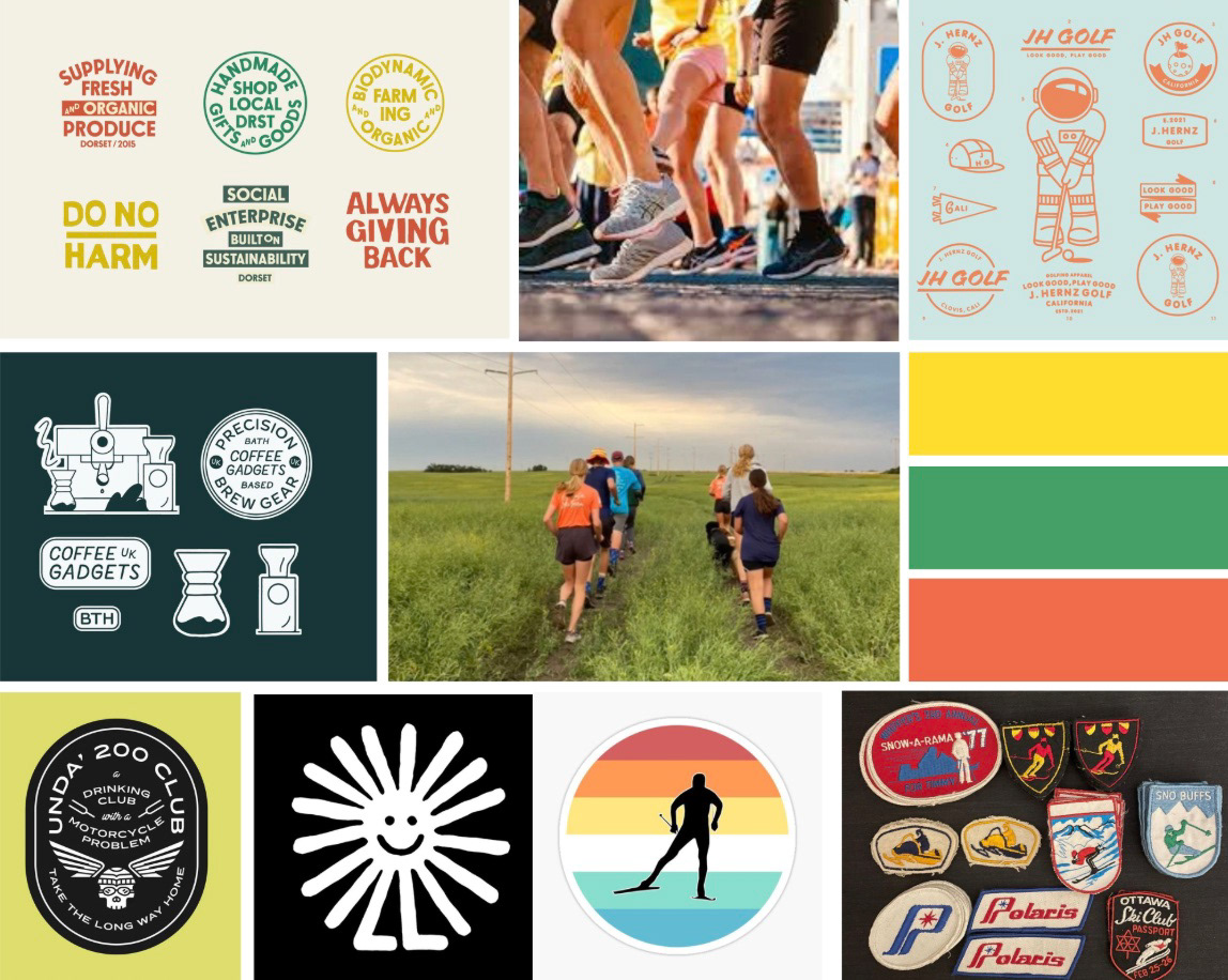
Process
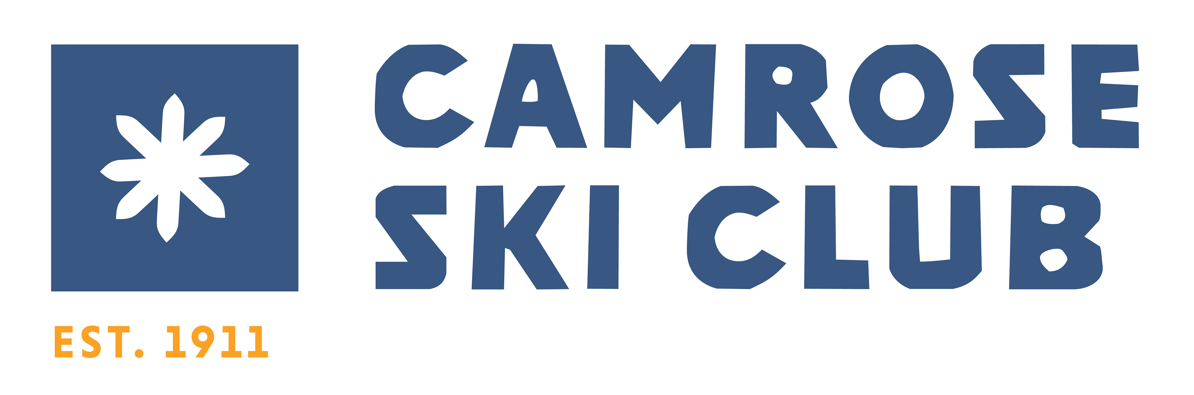
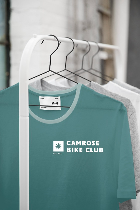
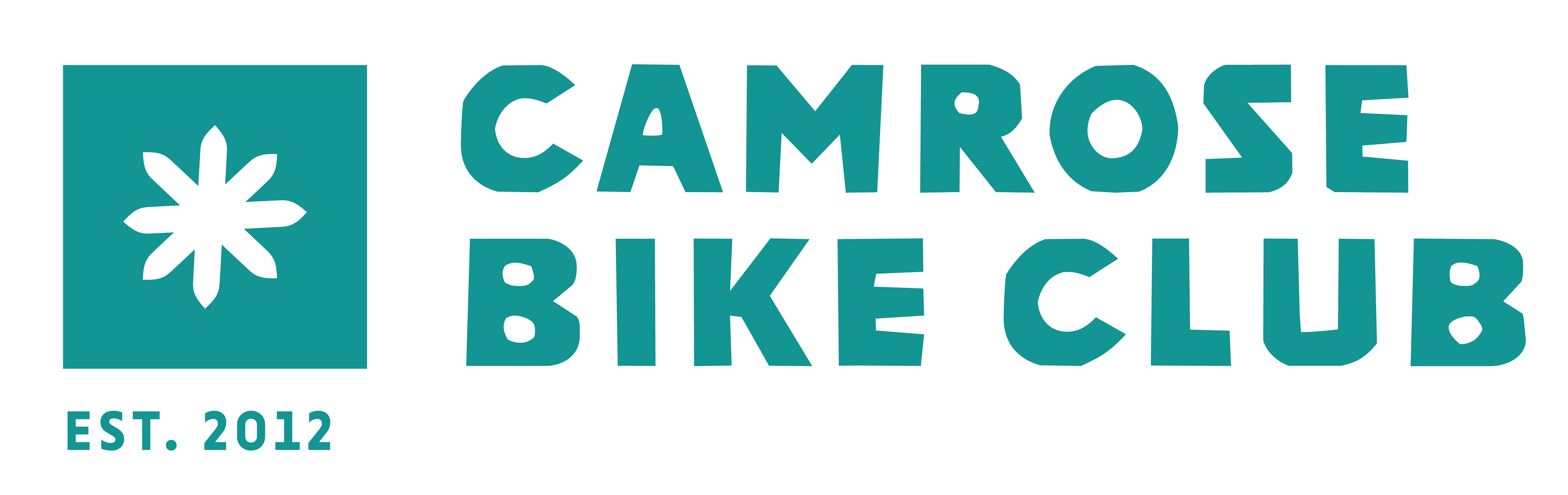
The Camrose Ski Club brand represents not only it’s history but it’s future. The icon on the left is reminiscent of a few different shapes, snowflake or even a flower. It can be perceived a few ways which is very versatile for a logo. It is simple, yet effective. The new brand introduces the club as approachable and fun. A retro style font want important to maintaining the strong history of the club. Bike, ski, and run are represented by different colours in order to create clarity between the different sections of the club.